I hear weekly book reviews can feel like an onslaught from your end. While there’s no need for you to keep up with my reading list, I’m thankful for the feedback—I’ll try to mix it up a bit more.
How about a behind the scenes look at writer artist collaboration? I’ve been asked about it: “How does it work? How do you get your artist to portray what you want?”
The answer is, we communicate back and forth a lot. Working with Aisha, my illustrator, the most effective tool is for me to send Google images of what I’m talking about: “Dress her in a shirt like this.” “Make her eyes this color.” “I’d like her hairdo to be something like this.” “She should look younger—something like this image.”
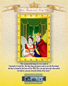
With Marjorie, my graphic designer, we communicate in words because we know each other well, and she has already struck a design tone and “look” with the character posters that I love. Here’s a condensed view of our recent writer artist collaboration on the character poster of Queen Titania and King Oberon:
“What color background do you want behind the portrait?” Marjorie asked. “I’m seeing a wallpaper-like design.”
 “Beige, I think,” I replied. “The walls in the condos in Fairy land are supposed to be beige.”
This is the first draft Marjorie sent me.
Uh-oh. I could see the beige tones undercut the powerful nature of the characters. It made them look wimpy. I didn’t want that.
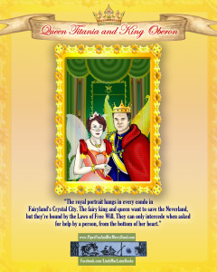
“Can you warm up the background? See if that helps?”

This is what came next.
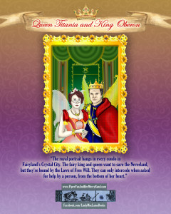
“I still don’t like it. It needs more ‘umpf,’” I said. “What ideas do you have?”
This was the next draft.
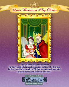
“Ah… SO much better! Now can you gussy up the banner? It needs to say “ta-da!”
 And so, we arrived at the final draft!
The writer artist collaboration might be my favorite part of creating my books!
Have you printed out your full-color version of the royal pair yet? Click here.
Until next week… fly high and keep your Joy Jumble full!